

Start with the complete label, not a colour family
A label is more useful when it is recorded whole. Dropping a suffix or one number can remove the only clue that distinguishes a rooted option from a similar-looking base shade.
Make one reliable note before you compare photos
For how to read BelleTress Envy and Estetica colour labels, begin by copying the brand, style name, complete colour name or code, and any letters after it. Add where the label appeared: a manufacturer chart, product page, tag, or retailer listing. This small record prevents a named shade, an abbreviated code, and a screen caption from being treated as the same evidence.
Use the brand’s own wording before translating it into everyday language such as warm brown or cool blonde. On its Icons Colors page, BelleTress explains that “R” in its listed names indicates a rooted design, with slightly darker roots. That supports recording “-R” rather than casually deleting it from a BelleTress shade name.
The catalogue is a sensible place to identify the exact wording attached to a style, but it is not a promise that two brands use a term identically. When browsing BelleTress wigs, keep the full label beside the product name. The comparison becomes more useful when it starts with an auditable label instead of an approximate memory of a photo.
- Copy capitals, hyphens, slashes, plus signs, and root markers exactly as displayed.
- Note the product style with the colour; a label alone does not describe the whole wearing experience.
- Save one front-view image and one written description when both are available, but do not treat either as a physical swatch.
Read rooted and dimensional language as placement clues
Words such as rooted, shadow, blend, highlight, and dimensional describe where contrast may appear. They are not a single scale of lightness shared by every manufacturer.
Ask what is darker, lighter, and where it sits
A rooted label generally directs attention to the area nearest the cap. It does not by itself tell you how long the darker area is, how strong its contrast will appear, or whether it suits your own regrowth pattern. Compare the root separately from the mid-lengths and ends. Then ask for confirmation of the root shade and its visible transition rather than assuming every rooted colour has the same placement.
Envy offers a clear example of why a label should be read as a brand statement. Its announcement about Rooted Shades says those colours use darker roots with a medium base and highlights for a multi-dimensional look. That establishes the three elements in that announcement; it does not make the same recipe a rule for every Envy colour or every other brand.
When comparing Envy wigs, describe the result you want in visible terms: a soft root, low contrast around the part, or brighter lengths. Those observations are clearer than saying only that you want an Envy colour “like” another brand. They also give a useful reason to check the exact style and official colour description together.
| Label clue | What it can usefully signal | Question to carry forward |
|---|---|---|
| BelleTress name ending in -R | BelleTress defines R as a rooted design with darker roots. | What is the root shade and how noticeable is the transition? |
| Envy Rooted Shade wording | The cited Envy announcement describes darker roots, a medium base, and highlights. | Which of those three elements is most visible from the part? |
| Estetica RT | Estetica’s guide defines RT as a natural base colour at the root. | What root code follows RT on this exact label? |
| H or CH on Estetica | Estetica defines H as highlights and CH as thicker contrasting streaks. | Is the desired contrast fine or deliberately bolder? |
| Several numbers separated by slashes | The label identifies a combination of listed components, not a guaranteed screen outcome. | Can the listed components be checked against the brand guide? |
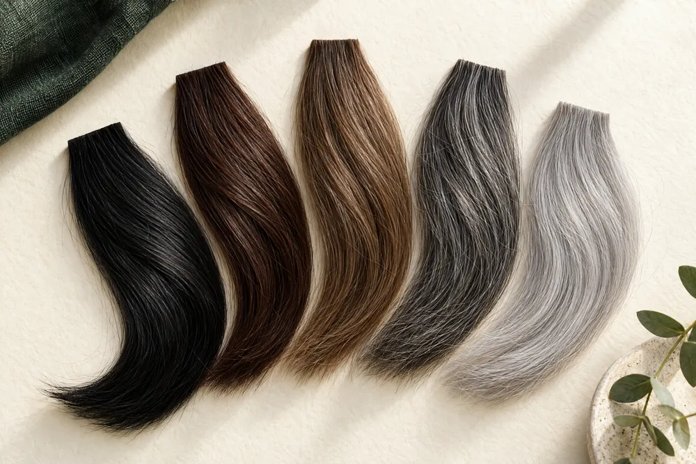
Decode Estetica numbers, slashes, and prefix markers
Estetica provides a published legend, so its labels can be separated into broad base families, combinations, and effect markers before a visual comparison begins.
Use the official legend before interpreting a code
Estetica’s Quick Color Guide groups base codes 1–12 as browns, 14–26 as blondes, 27–33 as reds, and 38–60 as gray to white. The same guide defines RT as rooted, H as highlight, CH as chunky highlight, F as frosted, LF as light front, ROM as ombré, T as tipped, and BT as blended tip. These are definitions for that guide, not an industry-wide alphabet.
Read a slash as a cue to inspect more than one listed component. For example, the guide’s named-code examples include combinations such as #8/24 and #33/30/27, and it also lists rooted codes such as RT12. The practical question is not which component must dominate in every photograph. It is which components and effect marker the official label actually contains.
A broader wig color chart can help you organise notes about depth, warmth, and grey presence across your options. Keep that colour-matching exercise separate from decoding a manufacturer’s notation. First establish what the particular brand says the letters and numbers mean; only then compare the visible family to your own reference photos.
- Copy an Estetica code as one string, including RT, H, CH, ROM, or other displayed markers.
- Use the base-code ranges to form a broad starting category, not to rank brightness between different brands.
- If a listing has a named shade and a numerical formula, retain both; the guide itself shows named-code equivalents.
Compare colour in your own visible context
The purpose of decoding is not to select a winner from a code alone. It is to make a repeatable comparison against the areas of your natural colour that will remain visible.
Use consistent light and a small reference set
Choose one neutral daylight position, one indoor position you commonly use, and one mirror or phone view. Photograph your visible roots, hairline, brows, and any natural grey at the same time of day. The aim is not to make a colour diagnosis. It is to state whether you are comparing a cool or warm impression, a dark or light root, and an even or high-contrast transition.
A label cannot decide whether a shade will feel harmonious with your skin, brows, glasses, or visible hair. It can, however, tell you which questions to ask. A code with a rooted marker invites a root comparison. A blended or highlighted description invites a look at contrast across the lengths. This approach avoids using generic words such as “natural” as if they described the same result for everyone.
If you are exploring cosmetic coverage while experiencing hair thinning or patchy loss, the colour record is only one part of selection. Our alopecia wigs guide keeps the focus on practical coverage considerations. Do not infer a medical benefit from a colour label, and do not rely on shade language to answer cap comfort or construction questions.
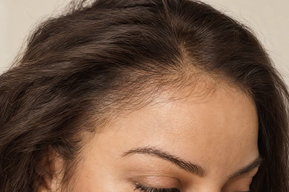
Keep colour questions separate from cap and style questions
A well-read label improves the colour conversation, but it does not establish fit, cap construction, fibre type, or suitability for a particular routine. Keep each question in its correct category.
Build an enquiry with one question per decision
Start with colour: “This exact label includes a root marker and several components; which element is strongest around the part?” Then ask a separate fit question: “What measurements and cap information should I check for this style?” That division makes it easier to compare answers. It also prevents a positive answer about a shade from being mistaken for confirmation that the cap will fit.
Before pairing a colour with a style, review wig cap sizes and record your own head measurements. Cap size is not embedded in a colour code. A petite, average, or large cap question should therefore stay independent of whether the chosen shade has a root, highlights, or grey tones.
This same distinction matters when the search begins from a men’s collection. HIM men’s wigs can be a relevant catalogue path if the cut or colour direction appeals, but a label still needs to be read on its own terms. Do not use a brand name, a gendered collection label, or a product photo as a shortcut for shade formula, cap size, or available options.
Turn your notes into a checkable colour enquiry
The best final note is short enough to send and specific enough that each part can be checked against the exact product and brand information.
Use a five-part message rather than a vague shade request
Write the brand and style first, followed by the full colour label exactly as shown. Next, name the one visual effect you want checked, such as “softest visible root around the part” or “less warmth through the lengths.” Add your own reference context, then finish with the cap-size question separately. This gives the recipient an orderly set of facts rather than an instruction to guess from a colour family.
For a cross-brand shortlist, put one label per line. A visit through Gabor wigs may provide another style or shade direction to note, yet it should not be treated as a translation key for BelleTress, Envy, or Estetica. Compare the written brand definitions and your visible reference needs, then ask about each item’s exact label rather than seeking a universal numerical equivalent.
You can use the same method with Rene of Paris wigs: save the exact colour wording, describe the desired depth or contrast, and ask the colour question independently from fit. Send OWNSTRAND the resulting note when you want help comparing an exact product listing. A response can then address the listed option without promising physical stock, a screen-perfect match, or a particular outcome.
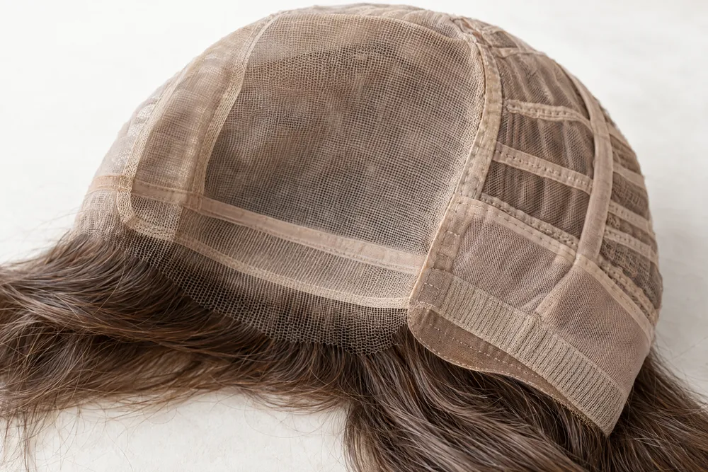
| Record field | What to enter | Why it matters |
|---|---|---|
| Brand and style | The maker and exact product/style name | Prevents a colour note being detached from the item it describes. |
| Full colour label | All words, numbers, slashes, hyphens, and letters | Preserves markers such as -R or RT for later checking. |
| Official definition | The relevant brand-guide wording | Separates a stated meaning from a personal interpretation. |
| Visible comparison | Root depth, warmth, grey presence, and contrast under your chosen light | Turns a generic shade name into observable criteria. |
| Separate fit question | Your measurement or cap query | Stops colour notation from being used as a proxy for fit. |
Ask OWNSTRAND on WhatsApp
Tell us the style you have in mind. We can discuss the options, quotation and arrangements before you decide.
Ask OWNSTRAND on WhatsAppBefore you choose
Does the same number mean the same colour across BelleTress, Envy, and Estetica?
Do not assume so. This guide treats each label as brand-specific. Estetica publishes base-code ranges and effect markers, BelleTress explains -R on its colour pages, and Envy describes its Rooted Shades in its own announcement. Start with the relevant manufacturer wording, then compare the visible result rather than translating a number automatically.
What should I ask when a colour ends in -R or includes RT?
Ask what the root element is on that exact label, how it transitions into the lengths, and how visible it is around the part and hairline. BelleTress uses -R for a rooted design in the cited guide, while Estetica defines RT as a natural base colour at the root. Neither marker answers cap fit or confirms a screen match.
Can I choose a colour from a website image alone?
Use the image as a reference, not as final proof. Keep the complete label, the official guide wording, and notes taken in consistent light. Ask a focused question about the root, blend, or warmth you want confirmed. This produces a more useful conversation than relying only on how a shade appears on one screen.
Further reading
- BelleTress Icons ColorsSupports the statement that BelleTress uses R in listed colour names to indicate a rooted design with slightly darker roots.
- ENVY: 12 New Multi-Dimensional Shades. Dozens of You.Supports the description of the announced Envy Rooted Shades as darker roots with a medium base and highlights.
- Estetica Designs Quick Color GuideSupports Estetica base-code ranges, named-code examples, and the definitions of R, H, CH, F, LF, ROM, RT, T, and BT.