

Start with one comparison frame, not a favourite photo
The first useful decision is to compare like with like. Choose the same page areas for every style and give yourself one viewing condition, so a dramatic campaign image does not outweigh the practical information beside it.
Set the same viewing task for every page
Start from the type of piece you actually want to explore, rather than comparing every hairstyle that looks appealing. The human hair wigs collection is a useful place to set that broad direction. From there, select pages with a similar intended silhouette or parting. Comparing a short straight bob with a long defined curl may show preference, but it will not answer a texture question fairly.
Use three labels in your notes: visible, stated and to confirm. “Visible” might say that the ends look softly turned under in the supplied image. “Stated” might repeat the texture term used by the page. “To confirm” is where you put the question that neither image nor wording settles, such as whether the displayed finish is the supplied starting texture or a styling presentation.
- Compare the lead image, the rear or side view, the specification text and the cap details in the same order.
- Keep the brand name and style name beside every note, so details are not accidentally transferred between pages.
- Leave a blank beside any field that is not published instead of filling it with a guess.
Read texture as a pattern, not just a label
Texture language is a useful starting point, but the photograph and description should be read together. The practical aim is to describe the shape you see clearly enough that another person can tell what you are asking about.
Observe shape at three viewing distances
Look at the full image first. Does the outline read as straight, a loose bend, repeated wave, curl or a more compact pattern? Then enlarge the image and look at the mid-lengths and ends separately. A supplier guide may use familiar categories such as straight, wavy, curly and kinky, as illustrated in Perfect Locks’ human-hair wig guide. Treat those categories as the page’s vocabulary, not a promise that every displayed strand behaves identically in every setting.
Colour can change how readily a wave or layered outline is seen. A deep shade may make the silhouette read as one smooth shape, while highlights can make individual bends appear stronger. If shade is part of the comparison, browse brown wigs separately and record the colour description beside the texture note. Do not use one page’s screen colour to decide another page’s shade.
Separate hair material from surface appearance
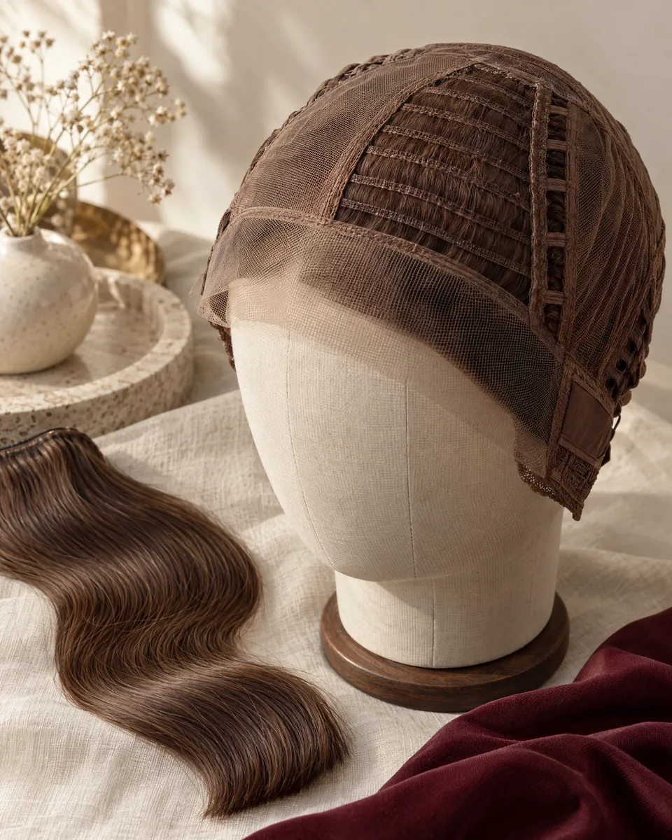
Words about hair material belong in your record, yet they answer a different question from the visible wave, shine or density in an image. Keeping those questions apart prevents a material term from doing more work than the page supports.
Read Remy as a term that needs context
The word “Remy” is often encountered while comparing human-hair pages. Jon Renau’s explanation of Remy and non-Remy hair describes Remy hair in terms of root-to-tip direction and cuticle alignment. The same source cautions that Remy and non-Remy do not, by themselves, state origin, length or an overall quality grade. That makes the exact description on the relevant page more valuable than an assumption drawn from the label alone.
When a description uses this vocabulary, use the Remy human hair wigs guide to frame the next question rather than to replace the page you are comparing. Write down the term as published, then ask what other construction, texture, processing or care information is specifically supplied for that style. This keeps the discussion tied to the item under consideration.
A glossy image, a softly blurred close-up or a model’s finished look cannot independently confirm the hair-material claim. It can still be useful for an appearance question: “Which visible texture feature should I expect to begin with?” Keep that separate from “What does the material description mean on this page?” The two questions can be asked together, but their answers should not be treated as the same evidence.
Put cap information beside the texture notes
Texture is what you see, while cap construction affects where hair sits and what parting or hairline information a page may describe. A comparison becomes more practical when both are on the same page of notes.
Ask what sits below the visible hair
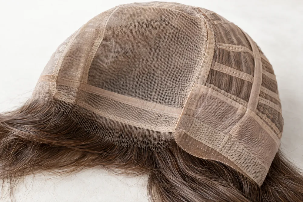
Construction terms should be read precisely. Headcovers’ cap-construction explainer distinguishes a lace front, which concerns the hairline, from monofilament construction, which concerns the part area. It also describes wefted and hand-tied approaches. Those distinctions explain why a texture photograph alone is not enough to answer a question about a visible part, an exposed front or how a style is intended to sit.
Fit also needs its own record. Use how to measure head circumference for a wig as a practical prompt to collect measurements before you ask about a named style. A page image cannot tell you which labelled size will suit your own head shape.
- Copy the construction term exactly as the page presents it, including whether it names a front, part, crown or full cap area.
- Put one question beside it: what feature of the shown parting, hairline or shape does this term relate to?
- Keep head measurements apart from a brand’s size label so they can be checked against the relevant style guidance.
- Ask about the particular piece rather than assuming one cap description applies across a whole brand.
Compare brand pages with one enquiry card
A consistent enquiry card helps when pages differ in photography, terminology and depth of detail. It is not a scorecard for declaring a winner; it is a way to make your question specific enough for a meaningful reply.
Turn page observations into brand-specific questions
For each page, write five short fields: style name, the photo view you mean, the visible texture cue, the published construction wording and one unanswered question. When browsing Amore wigs, for example, you might identify a particular page image and ask whether the soft movement seen around the face should be discussed as the style’s starting texture or as the presentation shown in that image. The point is to name the cue without guessing the answer.
Apply the same fields when reviewing BelleTress wigs. If one page makes the texture easy to see but gives little detail about the parting, your enquiry can stay narrow: “What published information is available about the part area for this style?” A focused gap is more useful than combining colour, cap, length, fit and care into one vague request for something “natural”.
Repeat the record for Estetica wigs without transferring a feature from a different brand page. A side photograph can justify a question about where a bend is most noticeable; it cannot establish the unseen cap or determine how that silhouette will sit on you. Keep the screenshot or page name with your note, so the comparison remains traceable when you return to it later.
The same method works for Noriko wigs. If two styles seem similar at first glance, identify one observable difference in each: perhaps one has a defined fringe while the other appears more open at the front. Then ask only the question that follows from that difference. This prevents an impressive photo from becoming a substitute for the specifications you still need.
Keep photos useful without treating them as proof
Photos are valuable evidence of what the page chooses to show. They are not a measuring tool, an inventory statement or a substitute for asking how a specific style relates to your own fit and routine.
Mark what an image cannot settle
A product image can help you identify a line, a curl placement, an apparent density or a shade family. It cannot verify current availability, a precise colour match on your screen, the feel of the cap, the result after a different cut, or a care and styling outcome not stated for that style. Marking these as “to confirm” does not make the image less useful; it protects your most important question from being hidden beneath an attractive presentation.
The limits are especially clear with fit. Daniel Alain’s head-measurement guide recommends recording circumference, front-to-nape and ear-crown-ear, and explains that head shape, hair underneath and cap construction can affect fit. Use those details to prepare an enquiry. Do not infer a personal fit result merely because the model’s image appears smooth at the temples or secure at the nape.
- Use photos to point to a feature you can describe, not to establish a promise the page does not make.
- Keep colour, cap, fit and texture as separate lines in your notes, even when they appear together in one image.
- Remove any conclusion that depends on current stock, pricing, a safety claim or an unlisted service condition.
- Save the question that matters most after you have compared the image with the written page detail.
Send a short, clear enquiry after the comparison
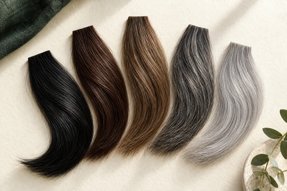
Once you have reduced the comparison to a few named pages and questions, the next step should be brief. A concise enquiry is easier to answer accurately than a long list of assumptions collected while browsing.
Use observation, context and one question
A practical message has three parts. First, name the brand page or style. Second, state the feature you observed: for example, “I see a loose bend beginning around the face in the side image.” Third, ask one confirmation question: “What information is available about the starting texture and the front or part area for this style?” This format makes clear which part is your observation and which part needs a reply.
| What you find on a brand page | What it can help you compare | What remains a question |
|---|---|---|
| Texture word and front, side or back images | The visual pattern and the language used to describe it | Whether the shown finish represents the starting texture for the named style. |
| Cap or parting description | Which visible area the construction language refers to | How the particular cap relates to your own fit and styling needs. |
| Material term such as Remy | The wording used for hair material on that page | What other style-specific details should be considered with that term. |
| Colour name and image | A shade family and how contrast affects the visible texture | An exact screen-to-real-life colour match. |
| A size label | The brand’s published size reference | Whether it suits your head measurements and intended way of wearing the piece. |
Ask OWNSTRAND on WhatsApp
Tell us the style you have in mind. We can discuss the options, quotation and arrangements before you decide.
Ask OWNSTRAND on WhatsAppBefore you choose
Can I compare textures from only the main product photos?
You can use main photos to identify a first impression, but compare the front, side, back and written description where available. Record the exact visual cue that interests you and ask about anything the images do not state, especially cap details, fit and the relationship between a styled finish and the starting texture.
Does a Remy label tell me how the texture will look on me?
No. Remy is material terminology, not a personal texture or fit result. Keep the published Remy wording in your notes, then compare the page’s texture description and ask style-specific questions about the features you are considering. Do not treat a label or photo as proof of every quality or performance detail.
What should I send when I ask about a style?
Send the exact style or page reference, say which image or visible texture feature prompted your question, and ask one clear question about the detail that remains uncertain. If fit is relevant, have your measurements ready. This is more useful than asking whether a page will look exactly the same on you.
Further reading
- Perfect Locks: Human Hair Wigs GuideSupports the use of published texture categories and the distinction between texture, cap construction, density and care information on a human-hair wig page.
- Jon Renau: REMY VS NON-REMY hairSupports the explanation that Remy refers to root-to-tip direction and cuticle alignment, and that Remy versus non-Remy does not itself state origin, length or an overall quality grade.
- Headcovers: Wig Cap Types ExplainedSupports the distinction between lace-front, monofilament, wefted and hand-tied construction terminology used when asking about a hairline or part area.
- Daniel Alain: How to Measure Your Head for a WigSupports recording circumference, front-to-nape and ear-crown-ear measurements, and the limitation that cap labels can vary by brand and style.