
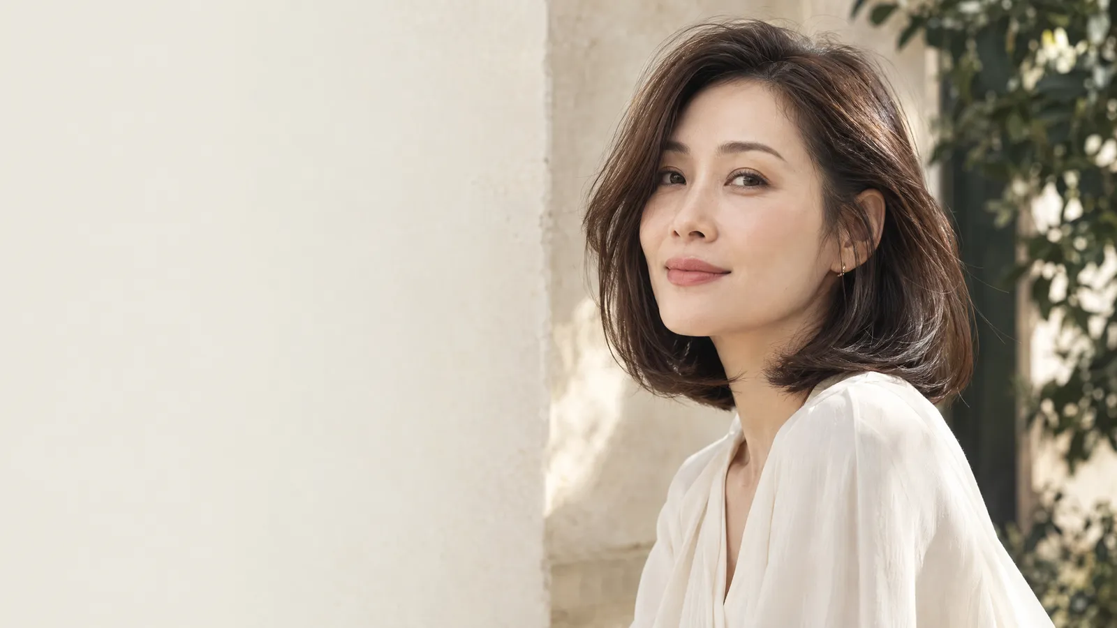
Why test a topper in two familiar light settings
A daylight check and an office-light check answer different practical questions. Daylight can reveal the outline and colour relationship at a distance. Indoor light shows what colleagues may see during a working day. Neither setting is a final verdict by itself, so comparing both is more informative than hunting for a single ‘perfect’ mirror.
Light changes the clues your eye uses
The appearance of an object depends partly on the light falling on it. The U.S. National Institute of Standards and Technology notes that the colour appearance of objects under artificial illumination is an important property of a light source, and that the familiar CRI measure addresses colour fidelity rather than every aspect of colour quality. Read its explanation of colour rendering of light sources as a reason to compare settings, not as a claim that one lamp score can approve a topper.
Start with indirect daylight rather than staring into strong sun. Stand near a window, face the light, then turn a quarter turn each way. This makes it easier to notice whether the root area, part line and crown keep a similar visual weight to the hair around them. Direct sun can create hard highlights that exaggerate individual fibres, so note it as a separate, harsher condition rather than treating it as the only natural-light test.
Office light is useful because it often comes from above and may combine with window light. Look first at the top of the head, then at the front transition and side profile. A piece that appears slightly warmer, cooler or flatter in this setting may still blend well. The decision point is whether the difference reads as a coherent variation in hair or as a clear boundary that remains visible while you move.
Set up a repeatable daylight and office-light check
The comparison only helps when the conditions are close enough to repeat. You do not need specialist equipment. You do need a stable parting, a plain background, a clean mirror and a short record of what changed. That turns an impression such as ‘it looked odd’ into a useful observation.
Keep the placement, angle and background stable
Place the topper as you would normally wear it. Make the same part, smooth the surrounding hair in the same direction, and avoid changing the curl pattern between locations. Check from arm’s length first, then at a conversational distance. A plain, mid-tone wall or uncluttered room helps you see the hairline and crown without a patterned background competing for attention. Repeat the same head positions: front, each side, a gentle downward glance and a slow turn.
Before changing rooms, make a simple note of the attachment location, part direction and any styling product used. If the concern is the join between your own hair and the added hair, the practical placement sequence in how to blend a hair topper with natural hair can help you describe where the transition stops looking continuous. A different part or a few centimetres of placement can alter the result more than a shade label suggests.
Use the checklist below once in daylight and once at the usual desk, meeting room or lift-area lighting. Mark only what you can actually see. Avoid guessing the fibre type, base material or lamp quality from an image. If an office has mixed light from windows and ceiling fixtures, record that fact; it gives the next conversation context without pretending to measure the lighting.
- Use the same mirror and the same part before making the second observation.
- Make a daylight note in open shade or by a bright window, not only under direct sun.
- Name the area that changes: root, part, crown, side transition or ends.
- Treat ‘uncertain’ as a useful outcome that deserves a closer in-person check.
| What to keep constant | What to observe | How to record it |
|---|---|---|
| Part direction | Does the part continue naturally into surrounding hair? | Same / boundary visible / uncertain |
| Attachment placement | Is the crown smooth before and after a slow head turn? | Settled / lifts / needs checking |
| Hair direction | Do added and natural lengths fall as one outline? | Continuous / separates at side / uncertain |
| Viewing distance | Is the concern visible only close up or also at conversation distance? | Close only / both distances |
| Lighting setting | Does the root, mid-length or end change first? | Daylight note and office-light note |
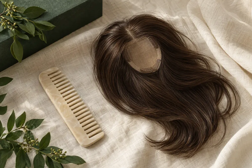
Read the blending clues daylight tends to reveal
Daylight is often the easier place to judge overall shape because it shows the relationship between the topper and the hair around it. The aim is not to inspect every strand. Look for a few repeatable visual clues that affect whether the crown reads as one hairstyle from the distances that matter to you.
Check the part, crown and outer silhouette
Face soft daylight and look at the part without pulling either hair section apart. Ask whether the density increases abruptly at one point, whether the visible part seems to stop, and whether the crown’s height looks balanced with the sides. Then take two steps back. At that distance, the more relevant question is often the silhouette: do the top and side contours look like one intended style, or does the crown look visually separate?
If the goal is mainly to soften a broad-looking part or add crown presence, describe the existing coverage as well as the light result. The coverage questions in hair topper for low volume are useful for separating ‘I need more area covered’ from ‘the current shade is different’. Adding more coverage does not automatically solve an edge or placement issue, and a small change in coverage may change the way daylight reaches the surrounding hair.
Watch the style while you move rather than holding perfectly still. Turn your head slowly, tilt it down as if reading, and tuck one side behind an ear only if that is part of your ordinary styling. A line that appears only after movement may be about direction, length integration or attachment placement. Record the exact motion that reveals it. That is more useful than saying the topper ‘does not blend’ in general.
- Observe first at arm’s length, then at a normal conversation distance.
- Check the front and both side profiles; a crown can look different from each angle.
- Write down the first area that catches your eye instead of trying to diagnose the cause.
- Repeat the check after a natural head turn, not after deliberately disturbing the hair.
Read the blending clues office light can expose
Ceiling light can put emphasis on the crown, while nearby windows introduce a second colour and direction of light. This is why an office check should happen in the area where you normally work, not only in a washroom mirror. Look for a persistent visual boundary, then compare it with the daylight record before assuming it is a product issue.
Separate a colour cast from a construction clue
Artificial white light does not reveal every colour in the same way. NIST explains that white-light spectra can differ and that colour preference is not identical to colour fidelity in its discussion, A Standard for Lighting Color Preference?. In practice, do not try to rate the office lighting yourself. Instead, compare whether the same root, part or edge looks different in office light while the physical placement remains settled and comfortable.
When reviewing a human hair topper, make the observation about the individual piece in front of you. Note whether the root-to-length relationship and the surface sheen look coherent with your own hair under the two settings. It is not safe to infer heat tolerance, colour-treatment history or a care routine merely from how the hair looks under a ceiling light. Ask for confirmation about the specific option if a care or styling decision depends on it.
The same restraint applies to a synthetic hair topper. Office light may make a surface reflection easier to notice, but a reflection alone cannot identify the fibre or prove that a topper is unsuitable. Record where it appears—perhaps on the crown, near the part or only when the head turns—and whether it also appeared in daylight. This creates a clear, neutral question about the particular piece rather than a broad assumption about every synthetic option.
Use photos as records, not as colour verdicts
Paired photos can preserve a concern that disappears when you try to explain it later. They are not a replacement for seeing the topper in person. A phone may brighten shadows, sharpen texture or shift the balance between warm and cool tones, so the value of a photo is its consistent framing and accompanying note.
Make two comparable images and label the conditions
Take one front image and one side image in each setting, using the same distance and keeping filters off. Include a little of the neckline or shoulders so head angle is easier to compare. Label the image ‘window daylight’ or ‘office ceiling light’, plus whether a window was also behind you. Nikon’s explanation of setting white balance notes that cameras compensate for lighting and that mixed lighting is more difficult, which is why the written condition matters alongside the image.
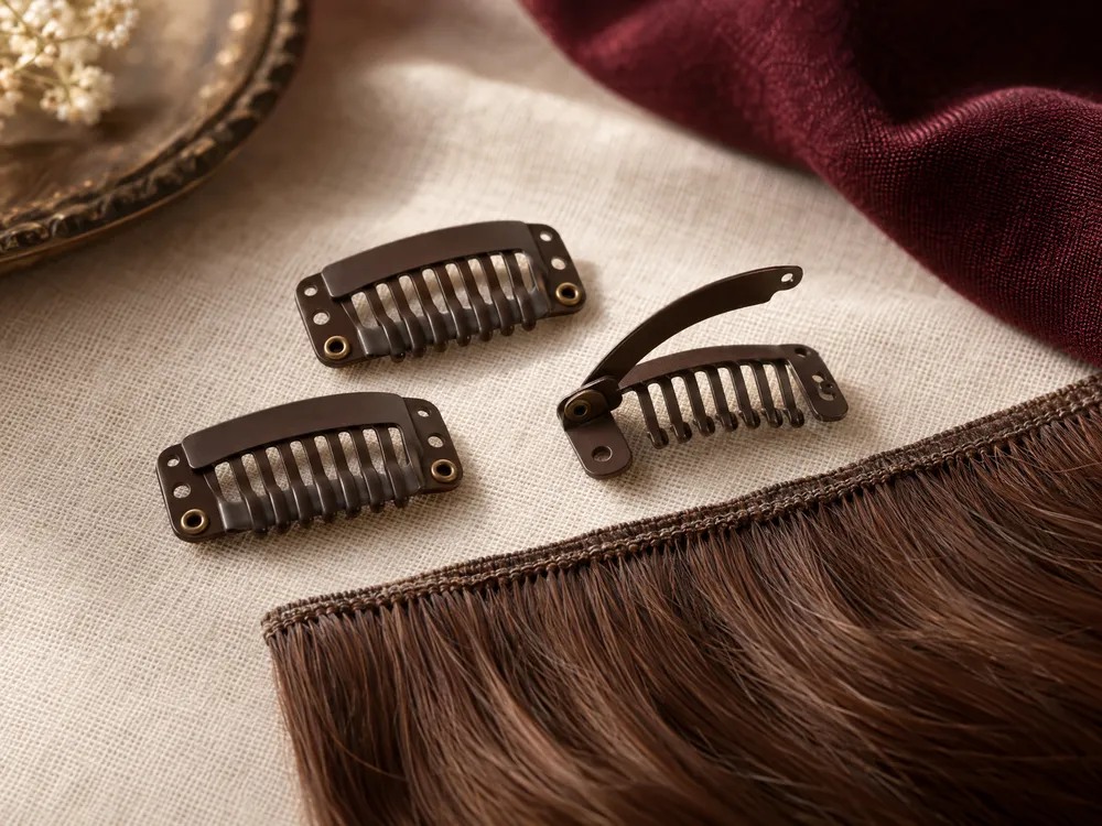
If your question is whether the top edge stays concealed during ordinary wear, use a short sequence of stills: front at rest, quarter turn, and gentle downward glance. The attachment-focused guide to a clip-in hair topper gives you language for asking about the attachment method, but photos cannot certify that an attachment will suit your own hair or placement. A visual record should lead to an informed conversation, not become evidence of a guaranteed result.
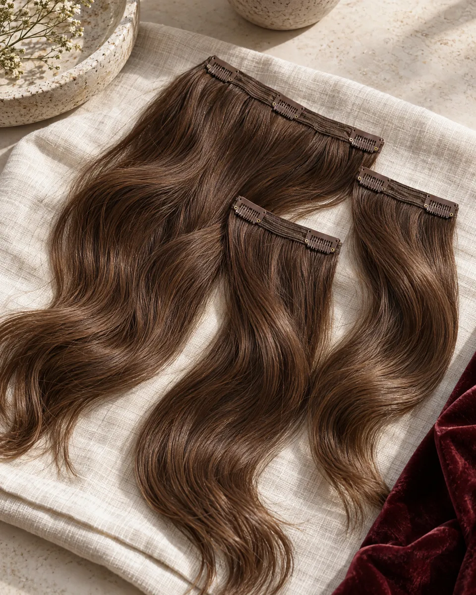
Keep styling comparisons separate from topper observations. For example, clip-in hair extensions may change the perceived balance of the lengths and make the crown seem different in a photo. If extensions are part of the intended look, photograph the topper both with and without them. That lets you identify whether the issue begins at the crown or results from the overall proportion of the finished hairstyle.
- Take the same front and side angles in each setting.
- Turn off filters and avoid portrait blur when recording the part or crown.
- Label the light source and whether daylight was mixed with ceiling light.
- Share the note with the image; an unlabelled photo can invite the wrong conclusion.
Turn your notes into clear selection and fit questions
The best next step is not a vague request for a topper that ‘looks natural’. Use your paired record to separate coverage, shade, placement and styling questions. This makes it easier to compare options fairly and helps ensure that a reply addresses the part of the result you actually want to change.
Ask about the observed issue, not an assumed solution
For an enquiry, state the setting, the angle and the clue: ‘In ceiling light, the crown looks more reflective after a quarter turn, while the part stays settled.’ Then ask whether a different placement, coverage area or option should be considered. If you are planning a budget conversation, use the preparation points on hair topper prices to ask what the quoted option includes. Do not assume that two different items, constructions or services are directly comparable from a photograph.
If you usually tie the lengths back after work, mention that as a separate styling context. A clip-in ponytail extension can affect the overall silhouette, but it does not answer whether the topper’s part or crown is blending. Bring a daylight and office-light photo of the final intended look where possible, then ask which observation concerns the topper and which concerns the ponytail style.
Keep the note factual and brief: where the image was taken, whether there was mixed light, what part you wore, and the first visible change. You can then ask to discuss fit, coverage, attachment and care questions for the specific option. This approach leaves room for an in-person visual check when a photo is ambiguous, instead of making promises from a screen.
- State the light setting before describing the concern.
- Name one visible area: part, root, crown, side transition, edge or ends.
- Say whether the clue appears at rest, during a turn or only at close range.
- Ask separately about coverage, placement, attachment and the intended finished style.
| Paired observation | Most useful next question | Practical next step |
|---|---|---|
| Part is continuous in both settings, but office tone appears cooler | Is the tone shift only visible under this lighting? | Keep the paired note; compare the specific option in person if needed. |
| Crown boundary appears during a slow turn in both settings | Should placement, direction or coverage be reviewed? | Record the turn and angle that reveal it. |
| Only close-up photos show a concern | Does it remain visible at conversation distance? | Repeat the mirror check at both distances before deciding. |
| Daylight shows a separation at one side | Is the surrounding hair direction or length integration the issue? | Photograph the same side before and after ordinary styling. |
| Office light reveals a surface reflection but daylight does not | Can the specific option be viewed under similar indoor lighting? | Describe the exact location of the reflection without inferring fibre details. |
Ask OWNSTRAND on WhatsApp
Tell us the style you have in mind. We can discuss the options, quotation and arrangements before you decide.
Ask OWNSTRAND on WhatsAppBefore you choose
Should I judge topper blending only in daylight?
No. Indirect daylight is useful for observing the overall outline, part and coverage relationship, but office lighting may be the setting in which you spend most of the day. Check both with the same placement and style. Treat a difference as a clue to record, then decide whether it concerns colour appearance, coverage, direction or an attachment question for the specific piece.
Can a phone photo tell me whether a topper shade is correct?
A phone photo can document an angle and a visible concern, but it cannot confirm an exact shade. Camera white balance and mixed lighting can alter the record. Use comparable, unfiltered photos with a written lighting note, then view the topper in person when the decision depends on an exact colour, construction or care detail.
What is the most useful note to send with a topper enquiry?
Name the lighting setting, part direction, viewing distance and one specific clue. For example: ‘In office ceiling light, the part remains settled but the right crown separates after I turn my head.’ This is clearer than saying the piece looks wrong. It allows the conversation to focus on the observed area and the intended wearing context.
Further reading
- Color rendering of light sources | NISTSupports the statement that artificial illumination affects object colour appearance and that CRI is a colour-fidelity measure with recognised limits.
- A Standard for Lighting Color Preference? | NISTSupports the explanation that white-light spectra and colour preference can differ from colour fidelity.
- Setting White Balance | Nikon Learn & ExploreSupports the caution that cameras compensate for lighting and that mixed lighting can require different white-balance handling.